Sol De Fuego Cocina —
Menu Design
Adobe InDesign
Adobe Illustrator
Concept
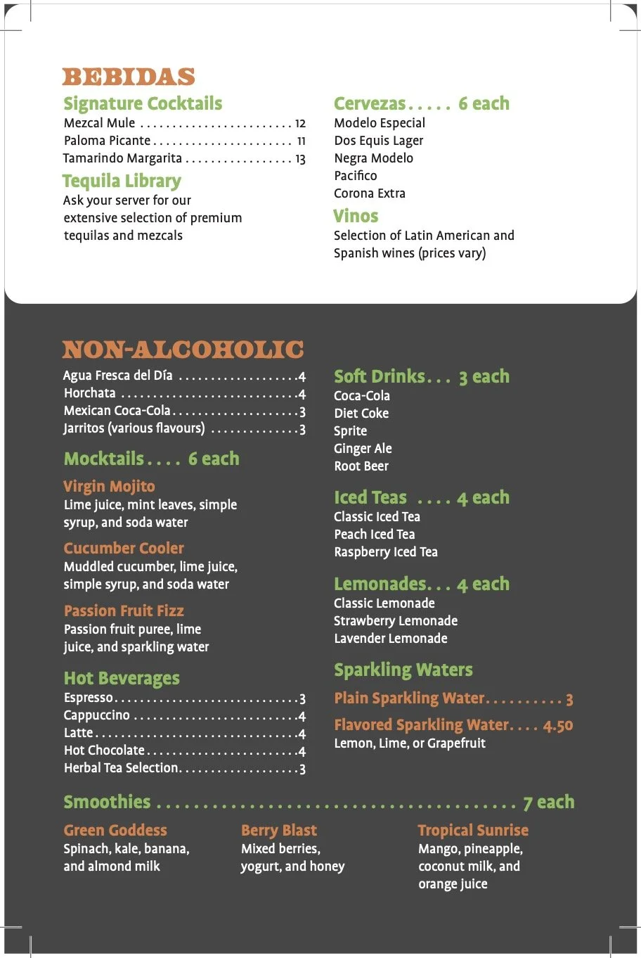
When designing this menu, two individual menus were used to encourage further ordering after the customer has ordered their main dishes. The secondary menu would hold the beverages, deserts and specials, while the main menu would demonstrate main dishes, sides and appetizers.
The vibrant orange and green colourway is inspired by the lime and chipotle flavours consistently used across this restaurant’s latin cuisine. Placing them on a charcoal background leaves a more vibrant impression, while reflecting the warmth of grilled smoky meals.
Development
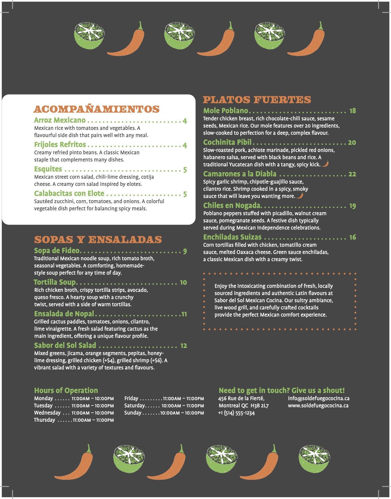
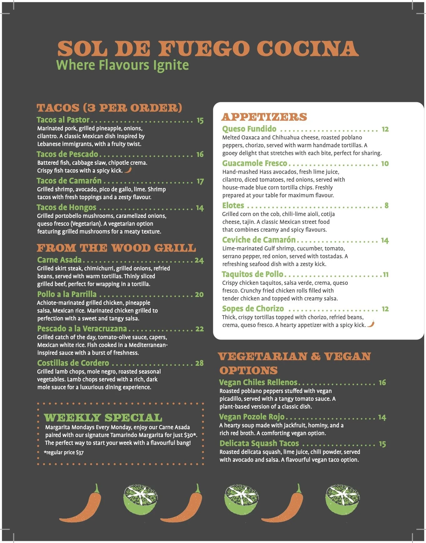
In order to create a cohesive menu, one bold and playful font was chosen for the main headings, while the body copy and secondary headings utilize a readable sans-serif typeface. Side dishes and appetizers will allow the restaurant to profit more from the main menu, so they are accentuated with a white background, contrasting the remainder of the pages.
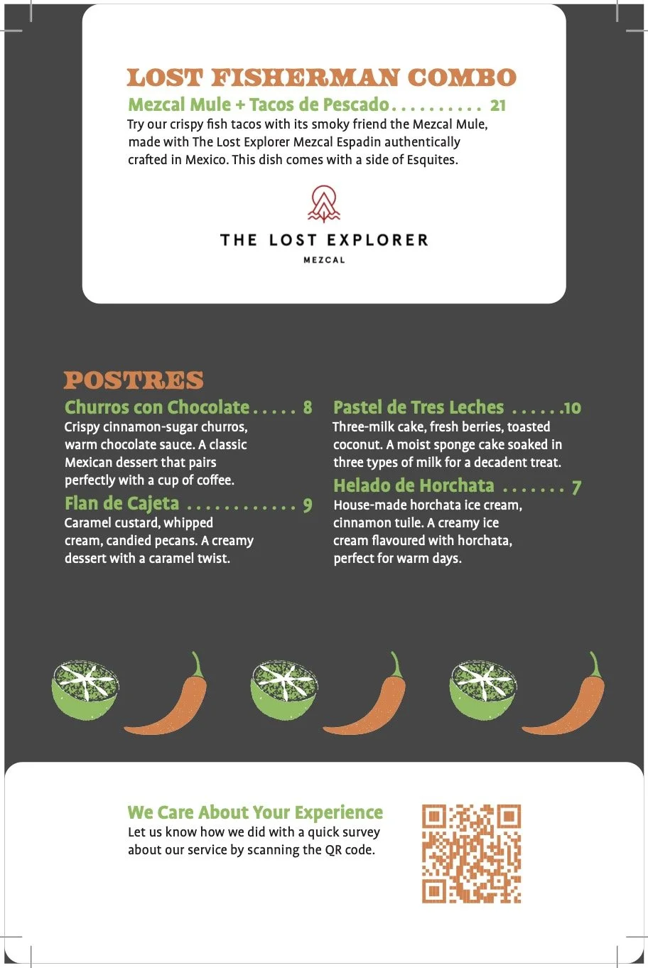
The same concepts were applied to the table menu, dividing the alcoholic and non-alcoholic beverages with contrasting backgrounds. A QR code was placed on the bottom of the table menu — requesting feedback from their customers — so the client’s business can continue to develop their services.
Outcome
Both menus reflect the same tones and design choices, allowing for a consistent dining experience. Designing a menu accounts for more than accessibility and following a grid. When considering the restaurant’s customers, they should be able to find what interests them without reading the entire menu. This project pushed me to think within the point of view of the consumer to decide which methods would make their experience as smooth as possible.